
Photo: Miniyo73 (CC)
Mobile is super important. You’re probably reading this on a phone.
Super. Important.
But we don’t necessarily treat it with due respect. Our sites may be fine for laptops, but terrible for mobile screens. Google, the main source of traffic for many sites, gives mobile-friendly sites priority. Soon, the search engine will have a completely separate index for mobile — that’s how important mobile is.
I have a couple of easy tests to ensure your site is mobile friendly.
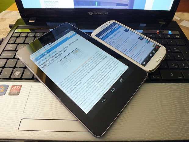
First, look at it in your phone. I do this all the time. It’s only one phone (an iPhone 5) out of many kinds (brand, operating system, screen resolution, screen size), but it’s a quick way to understand what a typical user might see. And I look at it in both landscape and portrait modes.
Second, look at it in MobileTest.me. This free site allows me to pick any popular device and see how any webpage renders on that device from my laptop. For example, see how this blog post looks on an HTC One.
Google has a more sophisticated free tool for mobile testing. Here’s what it has to say about today’s blog post.
It’s so easy. Let’s make sure our mobile visitors have a great experience looking at, reading and shopping on our sites. Otherwise, they might not ever come back.
P.S. Responsive web design isn’t always mobile friendly. Look closer.
•
Subscribe to the (mobile-friendly) free Y’all Connect newsletter …
|
|


Another way to see exactly what your site will look like on mobile sites is to use Google Chrome. Click on the three dots in the right corner to open up the menu. Select “More Tools” and then select “Developer Tools.” You should see a window pop open on the side of your browser showing some of the code from your site. If you look in the top left corner you will see a box with an arrow and beside that is an icon with a small rectangle on top of a larger rectangle. Select that icon and your site will open up in mobile view. Then at the top you will see an option to select different types of devices and a way to rotate your site as if you were to turn your phone sideways. I think it’s really cool and I use it when designing websites.
That’s a great suggestion, Taren! Thank you.